Babyganics
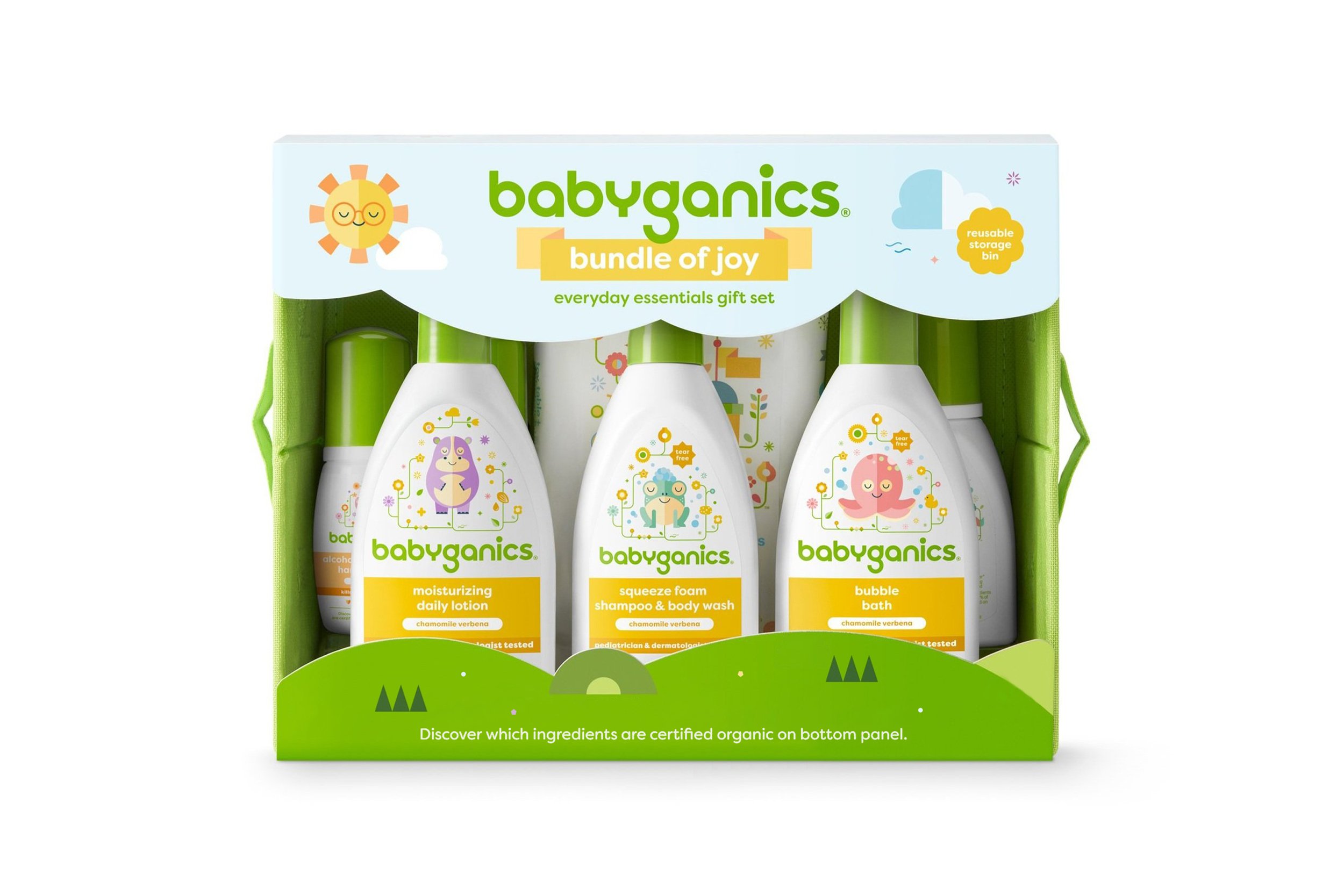
New packaging system improves shop-ability with the worlds tiniest influencers — from head and shoulders to tiny toes.
Role: Senior Graphic Designer
Responsibilities: Packaging system and content hierarchy, character and icon illustration.


The problem
There is an open space between baby and adult personal care, how do we align our product with
the consumer to help transition from one stage to
the next?
The solve
Introduce unique sub-brands that extend the core
brand story and visual equity over a wider age group.
The strategy
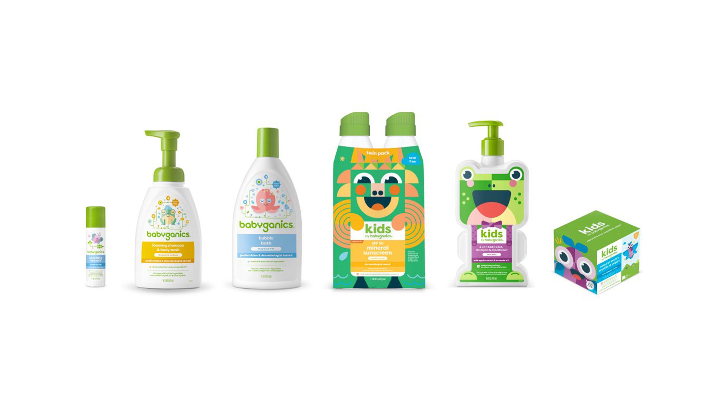
Refine content architecture, characters and packaging forms, while applying a new design language that speaks to each growth stage: Baby, Tots & Kids.
Our findings
Children can be quite persuasive when choosing products for the family! This allowed us to bring the Babyganics world to life and become even more playfully engaging — all while being easy to navigate for the adults.
Double-duty cuteness
This time around, the adorable characters are reimagined to take on a bigger role as product use and fragrance indicators. As shown here, the hand sanitizer bear waves its paws in warm mauve and mandarin accents.
Across the board, the design hierarchy remains consistent for easy navigation from baby to kids. As the sub-brands transition to each stage, the character (and color pallet) becomes more active and engaging. With the toy-like kids line, consumers can make playtime anytime with bright smiling characters that fully embody each package.


